Architect: Welton Becket Associates
Dates: 1971-1974
Address: 1111 E. Main St.
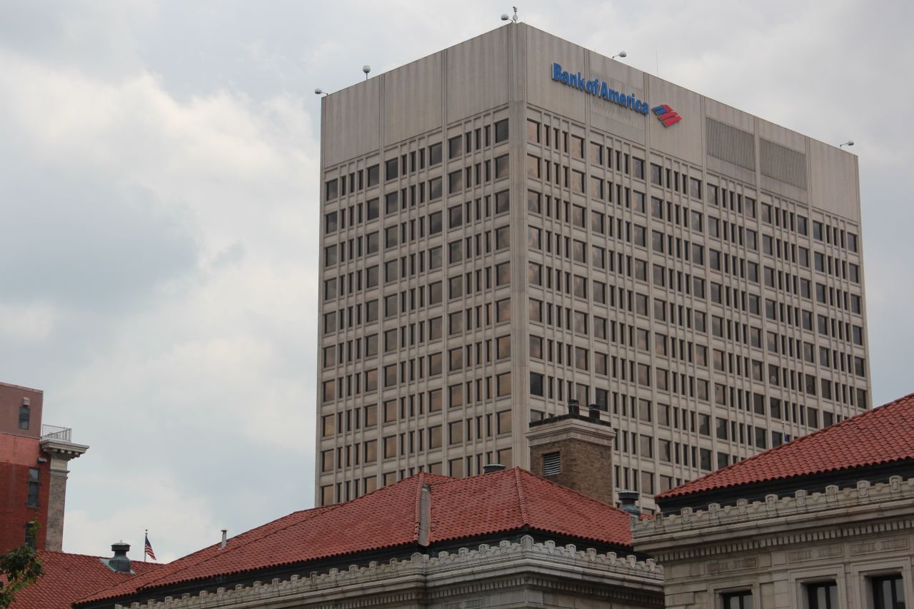
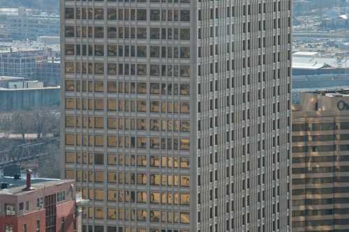
Still playing a role in Richmond’s skyline, the Bank of America Center was the tallest building in the city upon its completion in 1974. In addition to its height, the project is a symbol of its time in other ways. The building is an example of what Richmond considered to be progress in the mid to late 20th century. In order to create the tower, a half block of historic iron front buildings were demolished in spite of a long, bitter fight put up by preservationists.
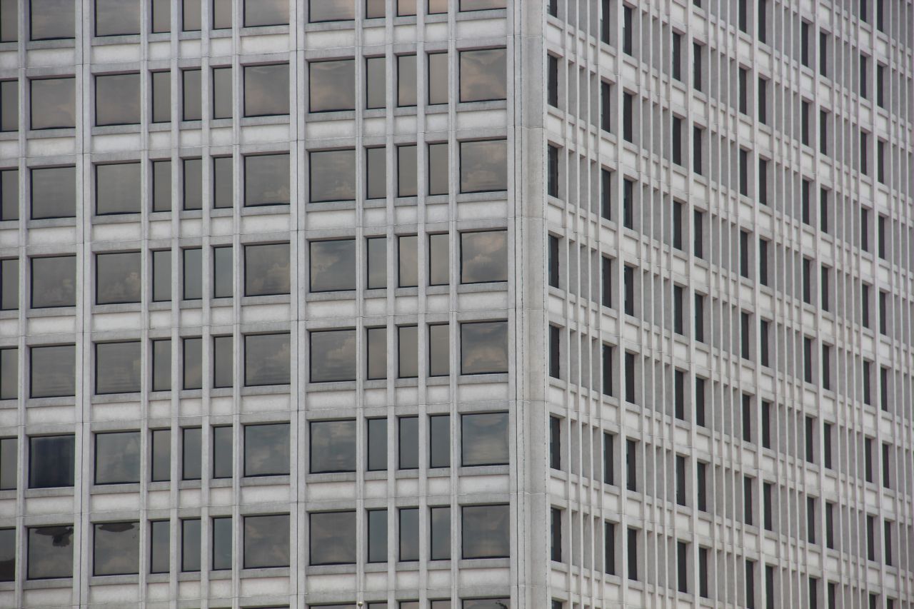
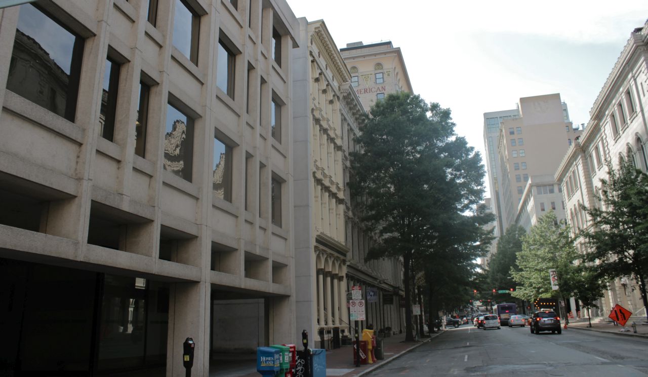
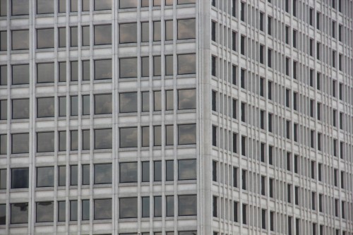
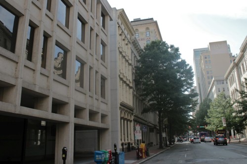
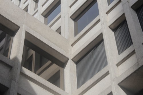
Fortunately, the First Merchant’s Bank (the original tenants) had the sense to commission a competent architectural firm to fill the gap. Los Angeles based Welton Becket Associates managed to design a structure that was at once forward thinking and sensitive to the site’s past and surroundings. First and foremost, it maintained a significant frontage on Main Street. In fact, the low Main Street wing of the tower’s base may be the complex’s most successful element. The precast concrete bands and gentle massing blur the line between neighboring historic iron fronts and the blatantly modern high rise complex. The concrete elegance of the base continues up the tower maintaining an acute attention to detail; the building looks good from up close or far away.
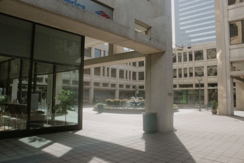
The tower itself sits back from the corner to create a public space. Most large developments in downtown Richmond in the later half of the 20th century were forced to include a certain amount of public space by the city government. This planning misconception is responsible for some areas of Richmond’s downtown appearing more like an inflated suburban office park than a city. While there are far too many plazas and courtyards in our downtown and far too little street interaction, the Bank of America Center is an example of one of the better site plans. The courtyard is rarely inhabited but at least it is set off from the street. The space fronting Main Street is somewhat populated and pleasant, mostly because of surrounding dining establishments and food carts.
The building’s chief failure, in terms of urban interaction at least, is its presence on Cary and 12th Streets. The poetry of a blank wall is part of the modern movement but the broad swaths of concrete on these streets, interrupted only by security cameras and parking entrances, feel more unconsidered than intentionally unadorned. The corner at 12th and Cary Streets is particularly egregious. An intersection that now contains retail on three corners is left unresolved by the austere insensitivity of the tower’s base. What’s more, the intersection serves as a critical link between the vibrant Shockoe Slip and its struggling neighbor, the financial district. One wonders if it would be possible to redevelop this corner in a manner more befitting its site.
D.OK.




Write a Comment