This article comes to us from guest writer Robert Winthrop. Winthrop is partner at Winthrop, Jenkins, and Associates, a Virginia based architecture firm specializing in historic renovation. Historic buildings have also been his focus in numerous writings and lectures. As author of The Architecture of Jackson Ward, Cast and Wrought: The Architectural Metalwork of Downtown Richmond, Virginia, and Architecture in Downtown Richmond, Winthrop has established himself as an authority on the city’s architectural history.
* * *
While Art Deco was the most flamboyant style of the 1920s, there was another more austere style developing at the same time. It was a stripped down form of classicism, that is now often associated with the architecture of Nazi Germany.
Historically, the style had nothing whatsoever to do with fascism. It developed as a reaction to the extravagant decoration of the early 20th Century. There was a movement to simplify and purge historical styles of extraneous ornamentation and reduce them to their essence. This intellectual movement was boosted by the disaster of World War I, and then reinforced by the Great Depression.
Some architects hoped that by stripping down the style it would become be economical, modern and functional. The most extreme expression of the tendency is the geometrical abstraction and cubic forms of what became the International Style. This is what we now call modern architecture. The simplified classicism is a milder expression of this taste for simplicity and minimalism.
In the United States the foremost proponent of the austere classical style was Paul Cret, a French architect who became the head of the University of Pennsylvania’s architecture department. Cret became the preferred designer for American World War I memorials in France. Cret almost had a major example of his work in Richmond.
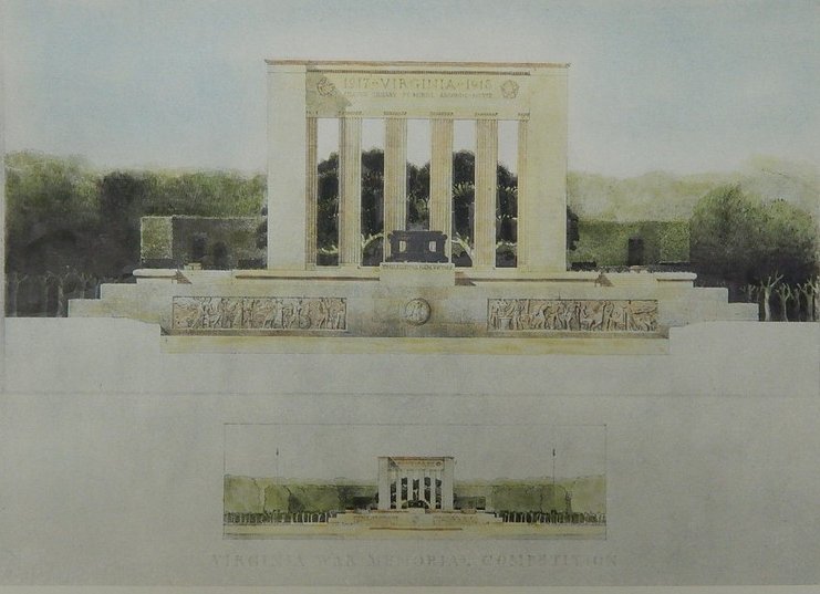
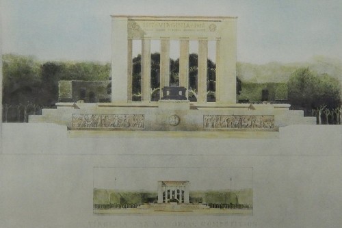
Richmond’s Marcellus Wright studied at Penn during Cret’s tenure. Wright and Cret designed a proposed World War I memorial for Byrd Park. This proposal was a simplified colonnade facing a reflecting pool. While Wright and Cret won the completion for the memorial, the project was never built. The Carillon, designed by Cram & Ferguson, replaced the Cret-Wright memorial. The politics of the memorial were complicated and Cret was on the losing end of the politics. Incidentally, the sunken area once planned for the reflecting pool remains.
The first example of the simplified classical style in Richmond was the Dooley Public Library. Baskervill and Lambert designed the building in association with Edward L. Tilton in 1930. Tilton worked for McKim, Meade & White and attended the Ecole des Beaux-Arts in Paris, before founding his own firm. His most notable early design was for the buildings on Ellis Island. When Carnegie Libraries were sprouting up across the nation, Tilton was a personal friend of Andrew Carnegie’s secretary James Bertram. Bertram recommended Tilton as a suitable architect to library building committees. Through that connection, Tilton came to design over fifty libraries.
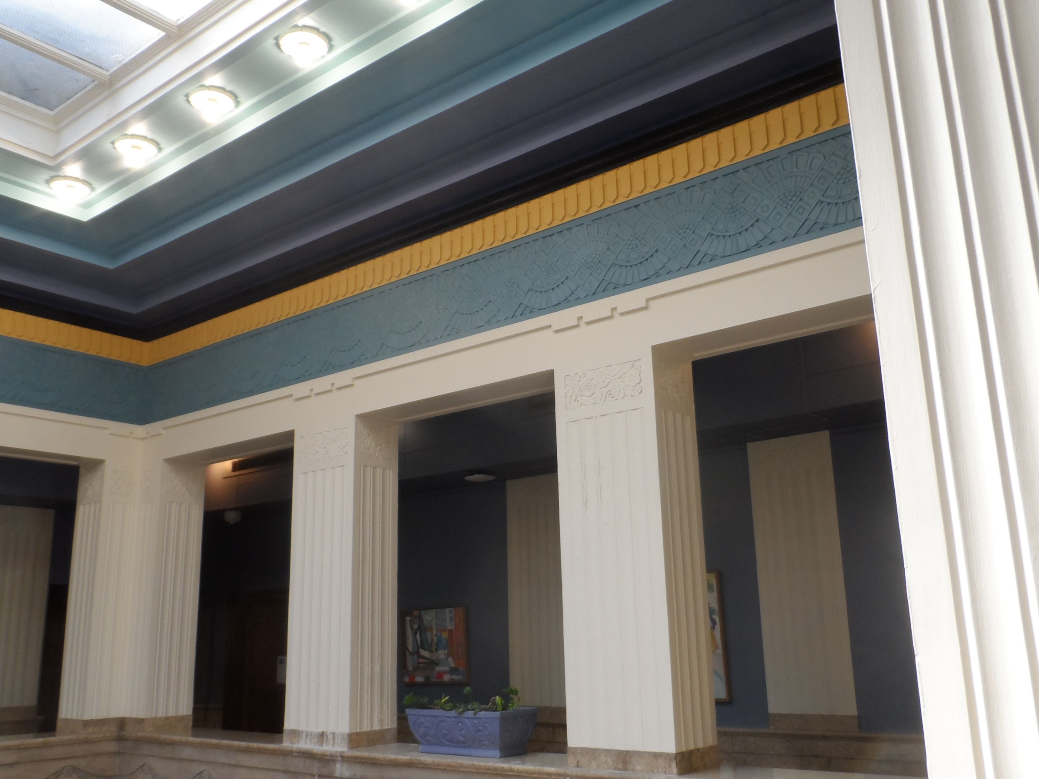
The Dooley Library is very much Tilton’s design. The original building is now entombed in the 1970s building. Fortunately, the interior lobby remains.
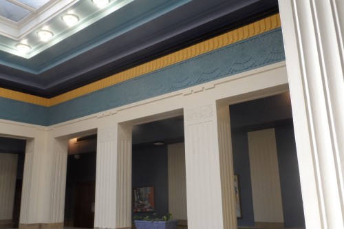
The lobby of the Richmond Library features travertine-like stone walls with Art Deco ornamentation. The plaster decoration makes use of shallow bas-reliefs in a combination of floral and geometrical motifs. The only sculptural decoration in the stone is an incised garland at the top of the wall. The upper level balcony-corridor is framed by a minimal colonnade; the columns are reduced to square piers with simple fluting. The capitals are panels of geometrical designs. The entablature is a band of modern ornamentation, but curiously the dentils are still related to their classical ancestors. The room has a large skylight and is handsome and well preserved.
Tilton later formed a partnership with Alfred M. Githens. After Tilton’s death in 1933, Keally & Githens carried on his library work. That firms most notable works were the Oregon State Capitol of 1936-38 and the Brooklyn Public Library of 1938. In Richmond they designed the Virginia State Library and Supreme Court Building on Capitol Square in 1939.
The State Library carried the simplification of classical forms to its furthest extent. The columns are simple piers and the entablature is an inspiring inscription. The library lobby is very simple and imposing. The long, narrow room is fully paneled and is in the stream lined Moderne Style. The lobby detailing is the same as the Oregon Capitol and is luxurious in its simplified way.
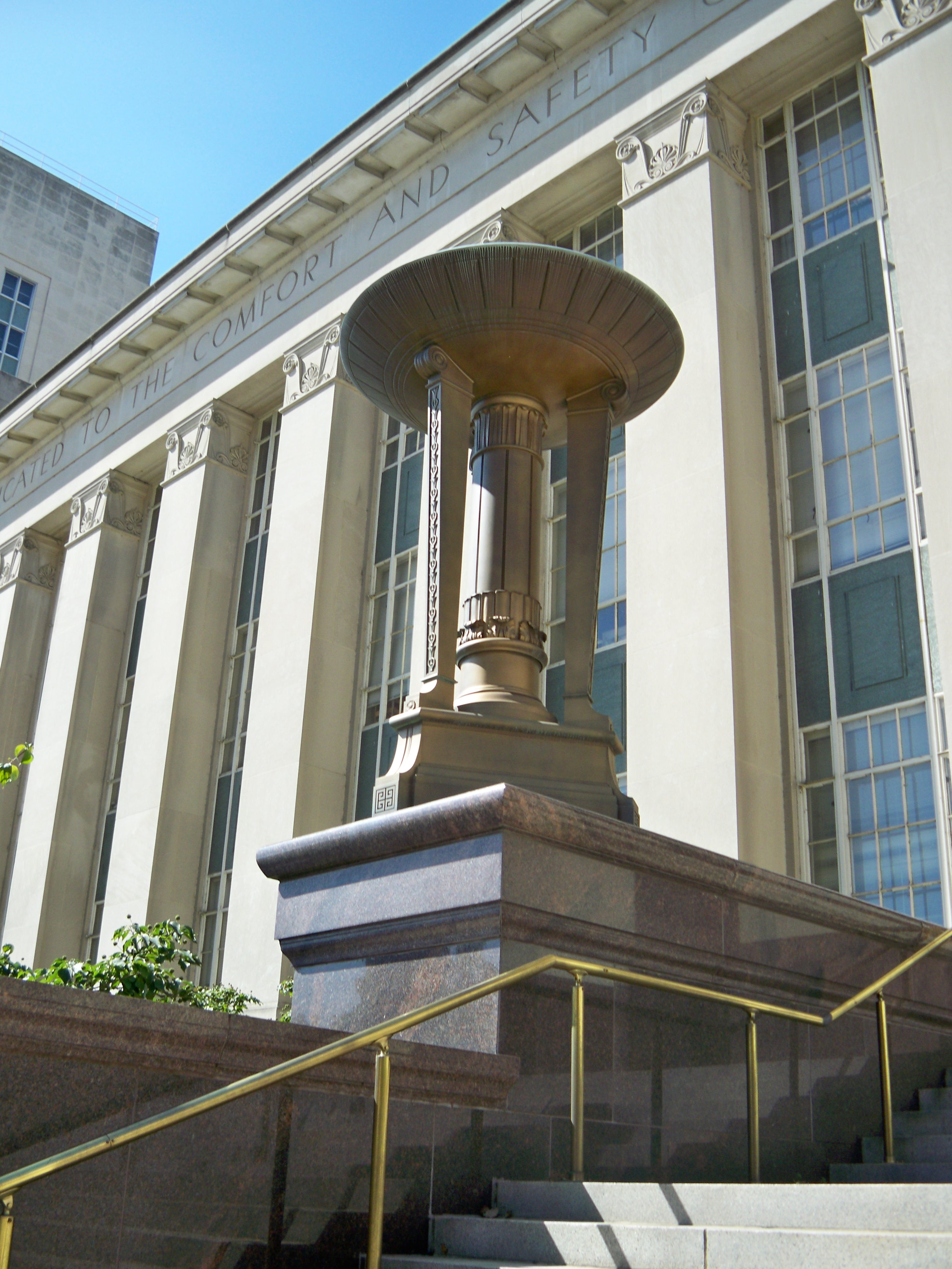
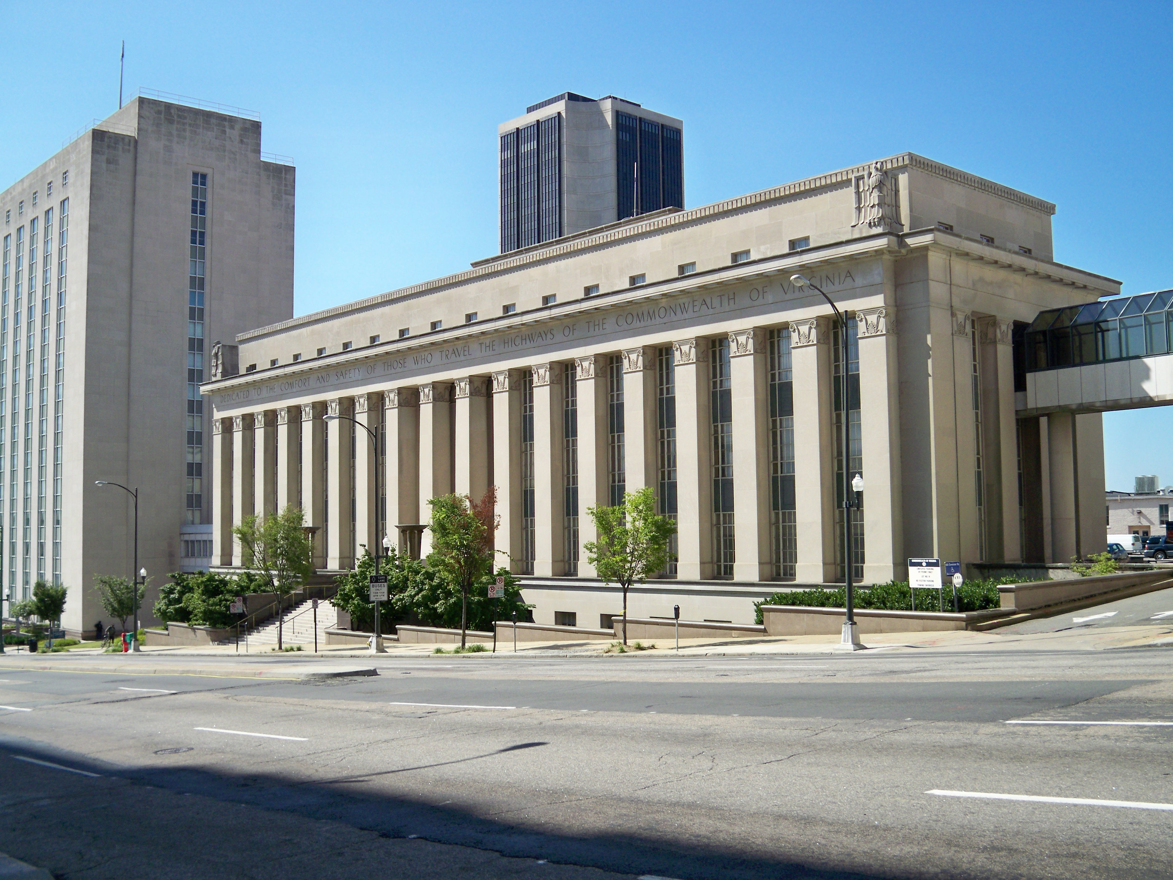
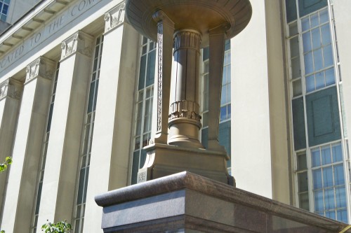
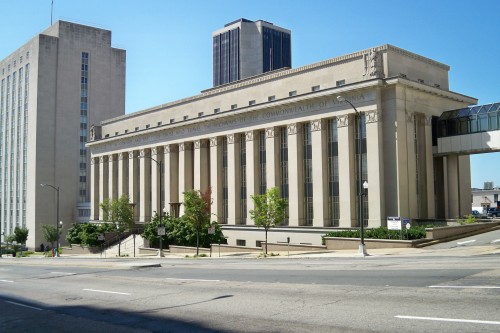
The most monumental and imposing building of the period is the state Highway Department building, designed by Carneal & Johnston. It dates from 1939. The Broad Street front consists of eighteen piers surmounted by stylized Ionic capitals. This is the longest colonnade in the city. A pair of huge bronze tripods, two massive limestone eagles and an inscription embellish the composition.
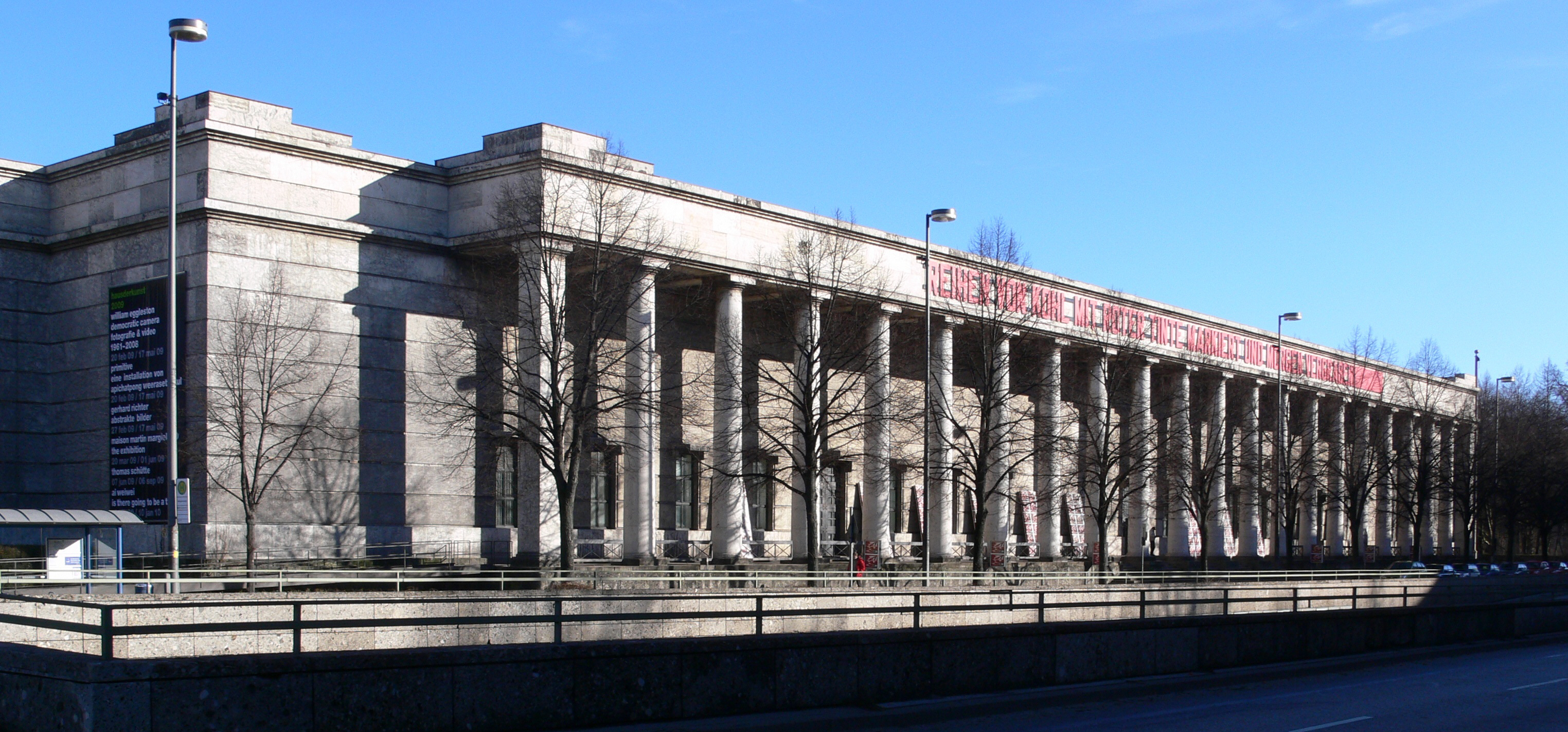
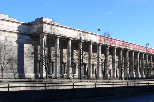
The composition is similar to Paul Ludwig Troost’s House of German Art in Munich. This building was dedicated with great fanfare in 1937 by Hitler. The long colonnade seems to have been a status symbol. It had 22 columns in its portico. Troost was Hitler’s favorite architect. After Troost’s death in 1934, Albert Speer replaced him as the dictator’s favorite designer.
The Highway Department Building had an impressive model nearer home. Robert Mills’ Treasury Building next to the White House has a colonnade of 34 Ionic columns. Built between 1836 and 1869 it was one of the most impressive office buildings in Washington and it is the model for many governmental buildings until the mid-twentieth century. The effect of the massed columns is imposing.
The Highway Department is more imposing than the State Library a block away. The Library’s minimalism may have reduced the building’s architectural effect. The addition of stepped library stacks on the roof in the 1970s unhappily gave the building a profile related to Lenin’s tomb in Moscow.
These buildings are caught between styles. They are not quite classical and not quite modern. They were serious efforts to deal with the problems of austerity brought on by the Great Depression. The architects hoped that by stripping off the “extraneous” ornamentation, they would arrive at a pure style. It seems that the ornamentation, refinements and subtleties of a style may be needed to maintain the basic nature of the style.
These buildings are more than historical oddities; they are a serious effort to create a modern classical style. While the effort may have been an architectural dead end, they are fine, well-built and well-considered buildings deserving of respect.
Robert P. Winthrop
Photographs by author.

Write a Comment