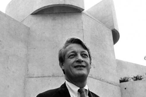
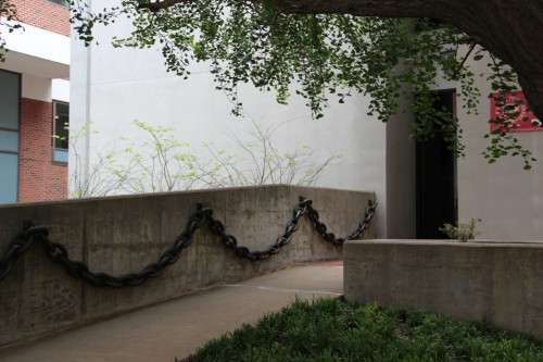
The Pollak Building

Pollak 1


Architect: Ballou and Justice
Dates: 1970
Address: 325 N. Harrison Street

On Harrison Street at the eastern terminus of West Avenue lies the Virginia Commonwealth University’s Pollak Building. The building is occupied by various parts of the VCU School of the Arts including the office of the dean, and the graphic design, fashion, film, and photography programs.

The Pollak Building is, in plan, reminiscent of Louis Kahn’s monumental form of modernism. The large stair towers anchor the building’s four corners while rectangular classroom blocks span the space in between. This creates a large interior courtyard planted with magnolia trees. This space is linked by foot paths to the Anderson Gallery, the Scott House, and the center of campus.

The courtyard is accessible to the public by way of a raised brutalistic arcade that extends to front Harrison Street. The street itself is presented with two main elements. First, spare concrete piers and stairs with a textured pattern left from the form molds used to create it and, second, a low brick wall. The space, though generous and attractive, is underutilized. This is somewhat troubling considering the high premium on space along the retail-heavy Harrison Street.

The principle facade begins at a story above street level and continues up a further 3 stories. Each of the four bars of classrooms and offices that make up the building are sided with blank concrete and fronted with concrete bands containing brick bays, each with two windows. The vertical windows and grid system employed by the facade reference the surrounding Victorian apartment and office buildings.

Recently, the building was outfitted with a green roof. VDMO Architects designed the roof to meet environmental goals such as reduced heat absorption and storm water runoff but the space is also recreational. A small terrace with views of the surrounding Monroe Park skyline and Fan District roof scape is a welcome addition to the Pollak Building.

D.OK.

White House of the Confederacy and Museum

White House of the Confederacy 6


Architects: Robert Mills, Petticord Associates
Date: 1818, Museum and renovation 1976
Address: 1201 East Clay Street

The Museum of the Confederacy’s main building, completed in 1976, was built to house the institution’s collection of confederate artifacts, the nation’s largest. The institution is the oldest museum in Richmond, founded in 1890, and includes on its grounds the White House of the Confederacy, the home of Jefferson Davis from 1861-1865.

The vast collections were originally kept in the house but in the 1970’s the museum shifted its collection to the new building and restored the White House to its original state. The museum sits on the same block as the historic structure, deep within Richmond’s Court End neighborhood. Together, the buildings and the garden space in between form an intimate and urban museum campus.

The White House of the Confederacy was designed in 1818 as the home of a wealthy Richmond bank executive. Robert Mills, architect of the Washington Monument, designed the building. The newer museum, the work of Petticord Associates, is a sharply modern structure that sits back from the street and takes a “L” shape, forming a square courtyard space between it and the historic center of confederate power.

The Museum of the Confederacy is a worthy piece of architecture in and of itself, but it is the interaction between it and the neighboring White House of the Confederacy, the way in which the modern structure responds to the historic mansion, that makes it one of the most intriguing and thoughtful works of architecture in Richmond. Robert Mills’ design for the home’s exterior is a massive, weighty, and stark piece of neoclassicism in the vein of famous English purist William Kent. The vast, unadorned planes of gray stucco, heavy double-column pairs on the rear porch, and sparse iron detailing give the house a sense of monumentality and simplicity nearing architectural brutalism.

This is picked up and elaborated on by the new museum building. Coffers, cantilevers, and bands of concrete suspended off of the main faces create shadow lines and ceiling details that mirror the massive porch of the historic structure. A nearly symmetrical face with three equally sized bays sits opposite the garden from the White House, foils the building and creates a secluded garden that seems a different world from the bustle of the high rise medical structures of the surrounding neighborhood.

D.OK.

Dominion Place

Dominion Place 6


Architect:  Pietro Belluschi Inc. with Jung / Brannen Associates

Date: 1978
Address: 1025 W. Grace Street

A stoic brutalist slab, the 12 story Dominion Place rises out of the leafy Fan District near the corner of Ryland Avenue and Grace Street. It is the closest Richmond has come to Unité d’Habitation, Le Corbusier’s famous housing tower in Marseille, France. Concrete and glass are the materials, though some brick is used at the base and to delineate the central stair tower. The building features a communal roof terrace.  The asymmetrical facade and rhythmically changing horizontal window bands may make the building feel radical comparative to the older surrounding neighborhood. However, its effect on the community is nearly identical to the adjacent Gresham Court apartment tower.

Dominion Place shares many functional similarities with its historic neighbor on West Franklin Street. Both are much higher than the most of the surrounding neighborhood, both house a large number of people, and both are set back from the street. While plantings fill both buildings’ setback space, a little more street interaction would have been welcome. A key difference between the buildings is their inhabitants. Dominion Place was designed specifically for seniors and those with disabilities. The subsidised rent is relative to income rather than market rate.

Overall, the building is a constructive part of the Fan District. It may have some design shortcomings but there are few buildings that do not. Dominion Place adds texture, diversity, and 250 much needed units to the neighborhood.

D.OK.

Opinion: Museum of the Confederacy


The Museum of the Confederacy is an exemplary piece of modernism in Richmond, responding to its site and program gracefully. The museum was designed in close proximity to the White House of the Confederacy, one of Richmond’s most significant historic buildings. Given this and its function as a frame for civil war artifacts, context is paramount in the design. The museum succeeds in its efforts to respond to the older structure while expressing the time in which it was built.

The Museum of the Confederacy is built in a style known to some as ‘Brutalism.’ The expression, born of the French term ‘Béton brut’ which describes exposed and unfinished concrete, refers to buildings composed largely of concrete and glass with irregular and asymmetrical massing.  The style was prevalent during the poor planning era of the 1960s and 1970s and is, as such, often associated with buildings that are unresponsive to the site and to human scale. The Museum of the Confederacy is a shining example of a building in the brutalist style working with the site and the context in an intimate and sensitive way.

The material is the most obvious connection between the two buildings. The Museum of the Confederacy uses a gray, lightly textured concrete which compliments the stark grey stucco of the White House beautifully. Mid afternoon light displays how rich and textured the concrete can be, appearing warmer and more irregular than the neighboring stucco. The plan of the building creates an intimate garden space that juxtaposes old and new beautifully. The face of the building directly opposite the White House mirrors its composition of symmetrical, regular bays while the massing of the building over all is an asymmetric ‘L’ which better suits the site.

The most invaluable gesture of the modern museum is that its largest cantilever, which covers the museum entrance, extends out towards the corner of the White House, creating a palpable tension. This reach, this search for a connection between present and past, between modern, objective scholarship and the tumultuous emotions of America’s Civil War, is abstracted and frozen in time. The Museum of the Confederacy’s achievement is in its dual nature. It both fosters a drama between it and its historic progenitor and crafts its mass, shadow, and material into harmony.

D.OK.

Current: In Memory of Ulrich Franzen


Noted architect Ulrich Franzen died on October 6th at the age of 91. He was born in Dusseldorf Germany but emigrated to the United States when he was 15. Franzen attended the Harvard Graduate School of Design where he met architects such as Philip Johnson, Paul Rudolph, and I.M. Pei who he worked for following graduation. Soon thereafter, he established Ulrich Franzen and Associates. Richmond is fortunate enough to be home to two works designed by Franzen.

The First Unitarian Universalist Church is one. Located near the Carillon in the leafy Byrd Park neighborhood, the structure is a single story composed of broad rectangular piers supporting a low slung roof. Walls are either floor to ceiling glass or concrete block with angled clerestory strips providing atmospheric lighting. The distinctive massing of the church relates to his residential work.

Franzen’s other mark on Richmond is a building on Philip Morris’ campus. Easily seen from I-95 south of Richmond, the materials are a warm chocolate brick and black reflective curtain wall. Franzen is well known for designing Philip Morris’ former headquarters, a 28 story tower in Midtown Manhattan.

From residences to offices to university buildings, each of Franzen’s projects had a different sensibility making it difficult to label him. On the whole, he could be most accurately characterized as a Brutalist which might explain the waning of his popularity in recent years. While his works in Richmond are not his most well known, Ulrich Franzen had an impact on the city and, indeed, architecture itself over the course of his career.

D.OK.

Image of Franzen courtesy of the Houston Chronicle, image of Franzen’s Philip Morris Tower courtesy of rediff.com

Bank of America Center


Architect: Welton Becket Associates

Dates: 1971-1974
Address: 1111 E. Main St.

Still playing a role in Richmond’s skyline, the Bank of America Center was the tallest building in the city upon its completion in 1974. In addition to its height, the project is a symbol of its time in other ways. The building is an example of what Richmond considered to be progress in the mid to late 20th century. In order to create the tower, a half block of historic iron front buildings were demolished in spite of a long, bitter fight put up by preservationists.

Fortunately, the First Merchant’s Bank (the original tenants) had the sense to commission a competent architectural firm to fill the gap. Los Angeles based Welton Becket Associates managed to design a structure that was at once forward thinking and sensitive to the site’s past and surroundings. First and foremost, it maintained a significant frontage on Main Street. In fact, the low Main Street wing of the tower’s base may be the complex’s most successful element. The precast concrete bands and gentle massing blur the line between neighboring historic iron fronts and the blatantly modern high rise complex. The concrete elegance of the base continues up the tower maintaining an acute attention to detail; the building looks good from up close or far away.

The tower itself sits back from the corner to create a public space. Most large developments in downtown Richmond in the later half of the 20th century were forced to include a certain amount of public space by the city government. This planning misconception is responsible for some areas of Richmond’s downtown appearing more like an inflated suburban office park than a city. While there are far too many plazas and courtyards in our downtown and far too little street interaction, the Bank of America Center is an example of one of the better site plans. The courtyard is rarely inhabited but at least it is set off from the street. The space fronting Main Street is somewhat populated and pleasant, mostly because of surrounding dining establishments and food carts.

The building’s chief failure, in terms of urban interaction at least, is its presence on Cary and 12th Streets. The poetry of a blank wall is part of the modern movement but the broad swaths of concrete on these streets, interrupted only by security cameras and parking entrances, feel more unconsidered than intentionally unadorned. The corner at 12th and Cary Streets is particularly egregious. An intersection that now contains retail on three corners is left unresolved by the austere insensitivity of the tower’s base. What’s more, the intersection serves as a critical link between the vibrant Shockoe Slip and its struggling neighbor, the financial district. One wonders if it would be possible to redevelop this corner in a manner more befitting its site.

D.OK.